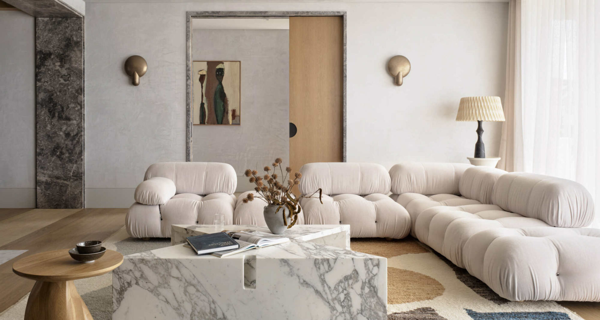
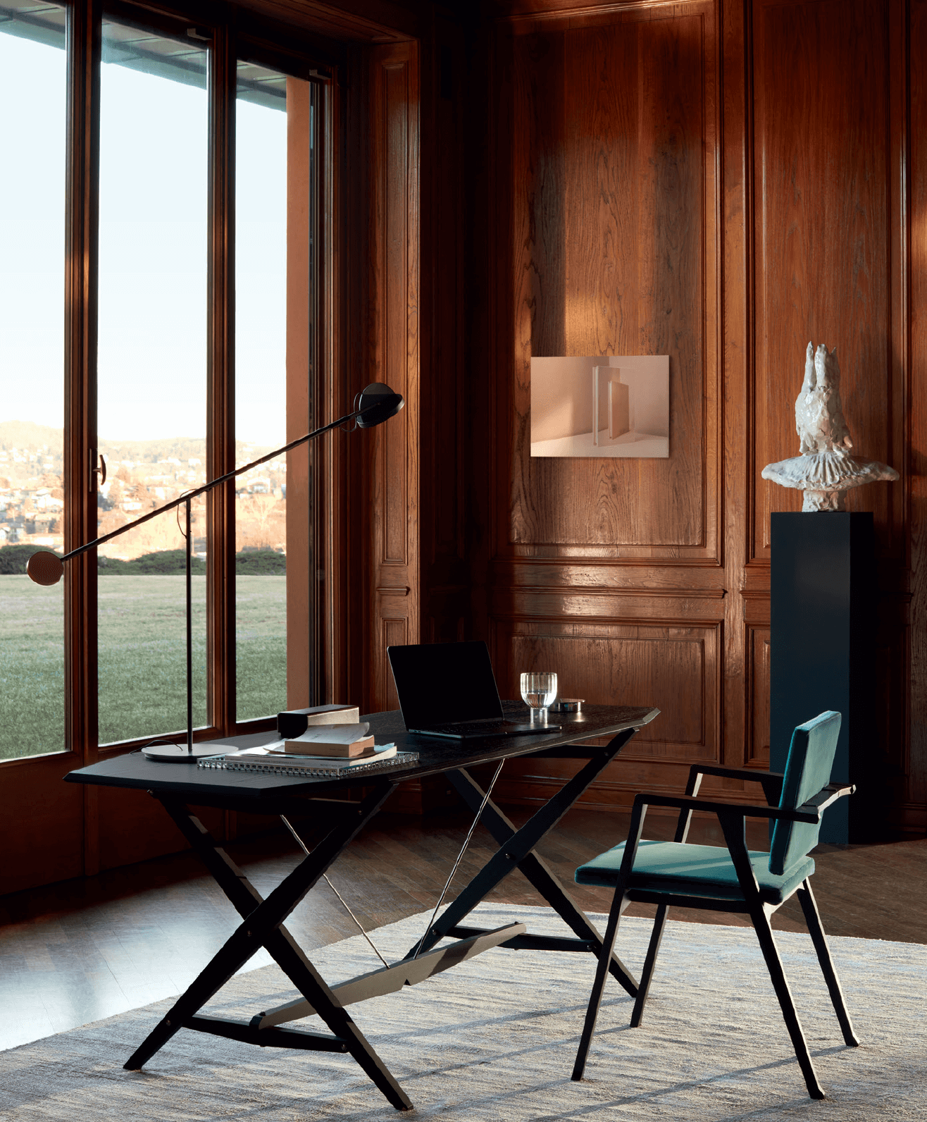
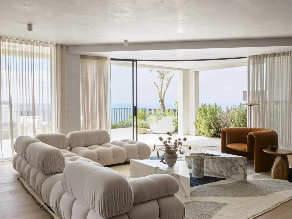
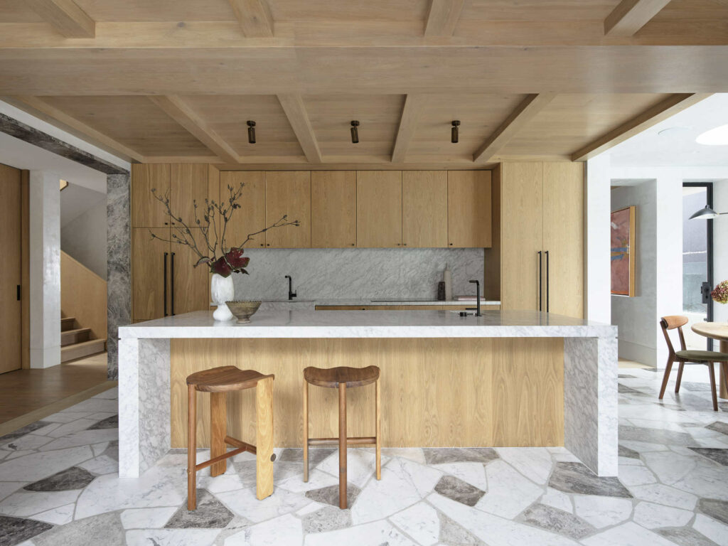
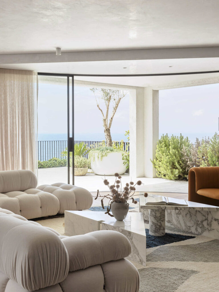
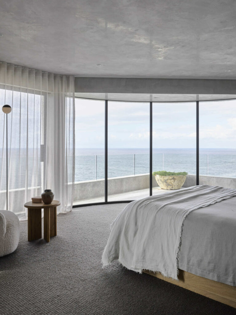
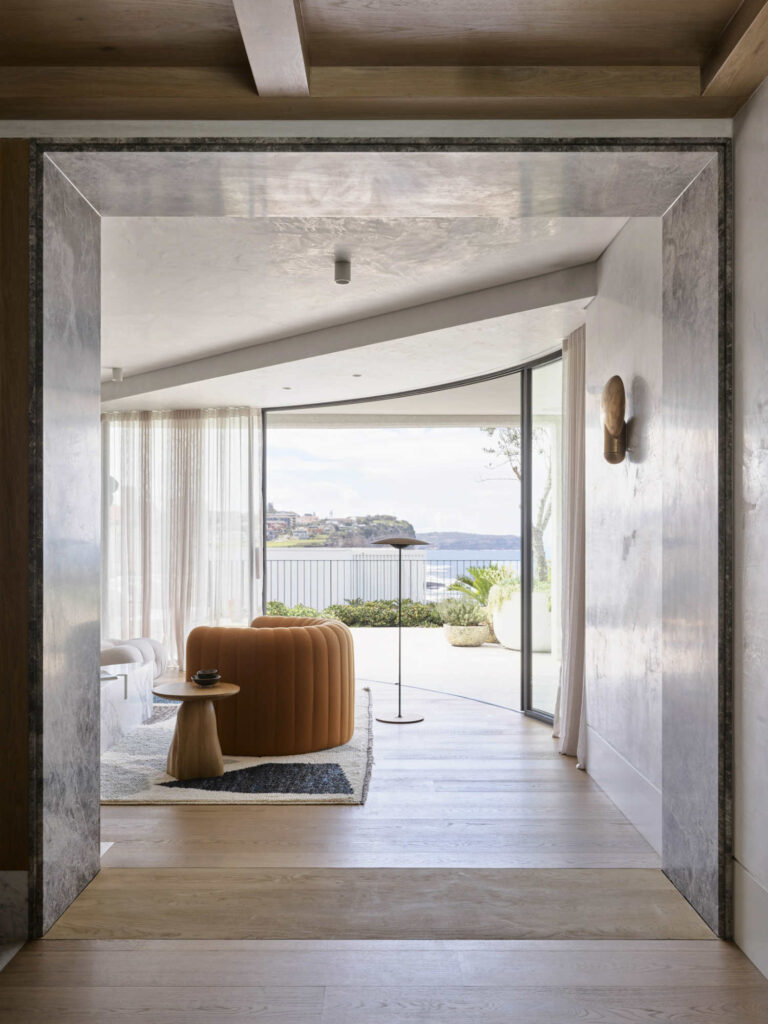
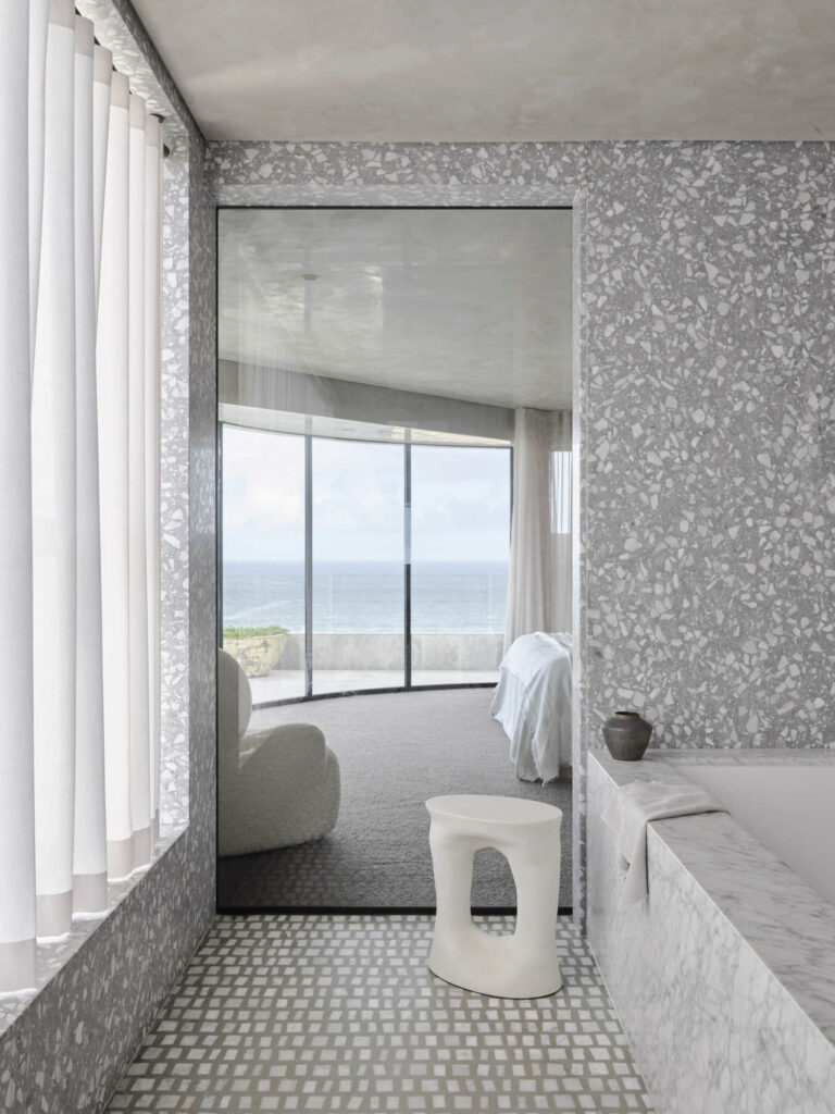
“Pacific House” is nestled on a spectacular cliffside facing the ocean, a 1990s concrete-framed dwelling that has been given a new lease on life by Sydney interior design&architecture company Alexander & CO. The house has undergone a major transformation that has turned it into a materially rich and modern family dwelling that is not only functional but also stylish. Interior designers had to replan the house fundamentally in order to make it fully functional and modern for the family with children, with a focus on the practicalities of family life and ocean adjacency. The result is a two-sided dwelling that offers a kitchen and garden side with a pool and a view side for the adults and the contemplation of watching the ocean.
Don’t forget to pin photos to read it later!
[block rendering halted]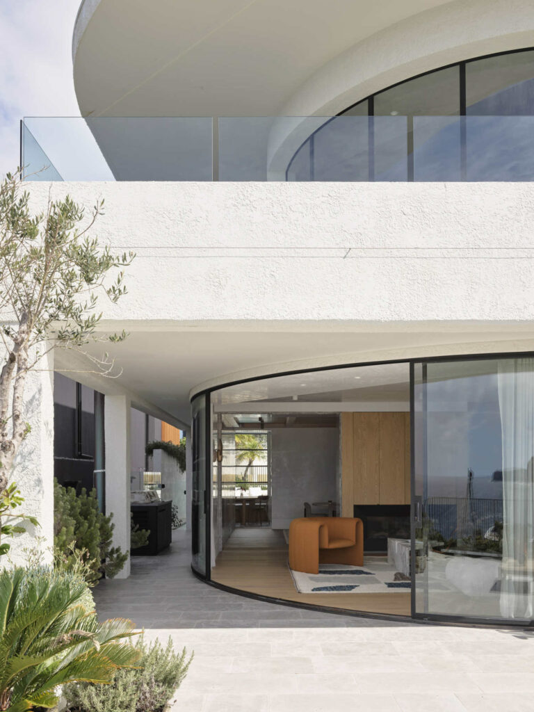
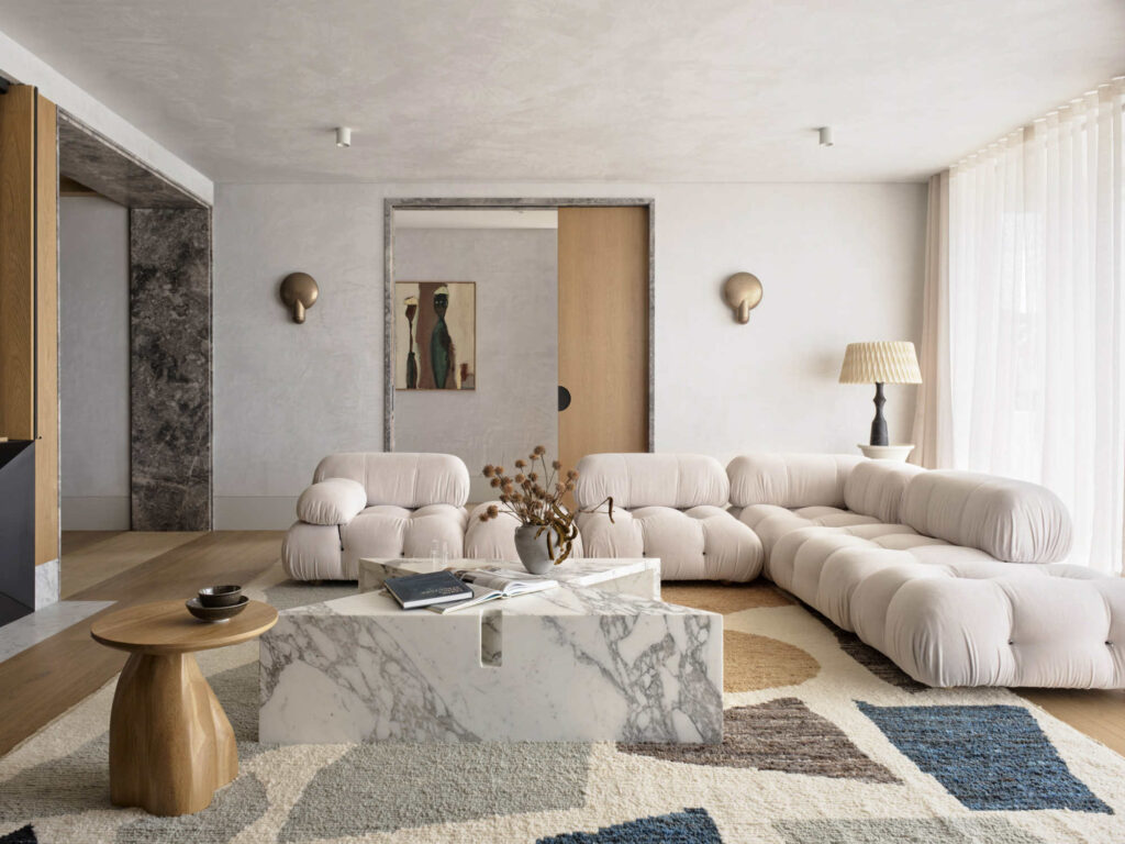
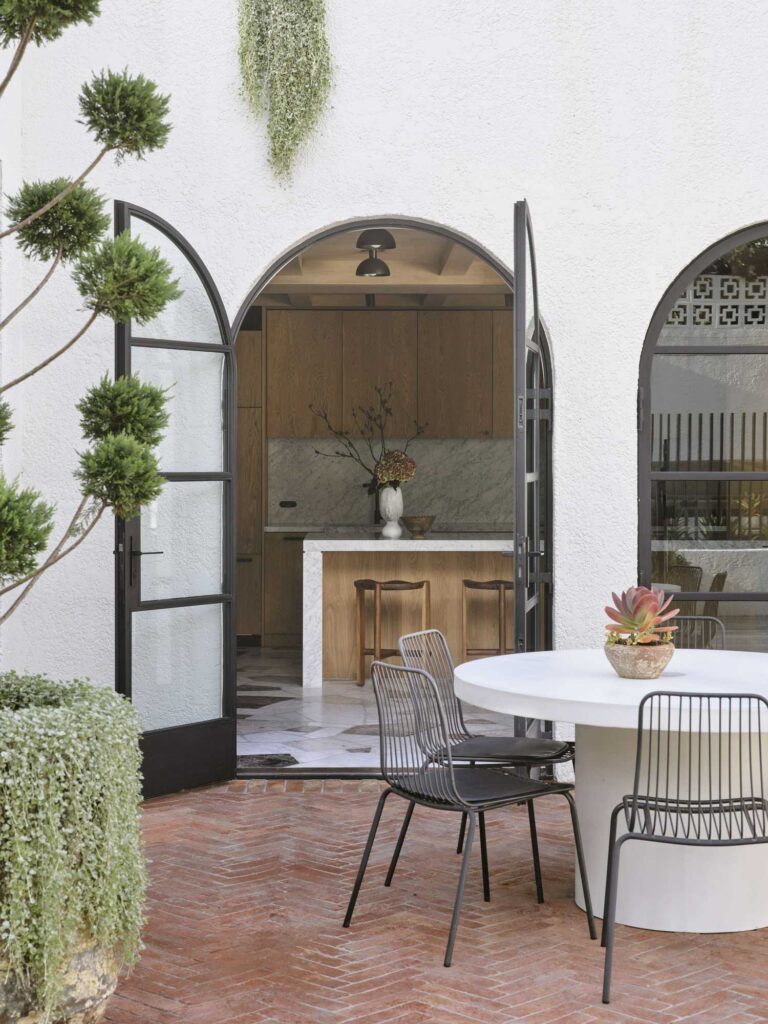
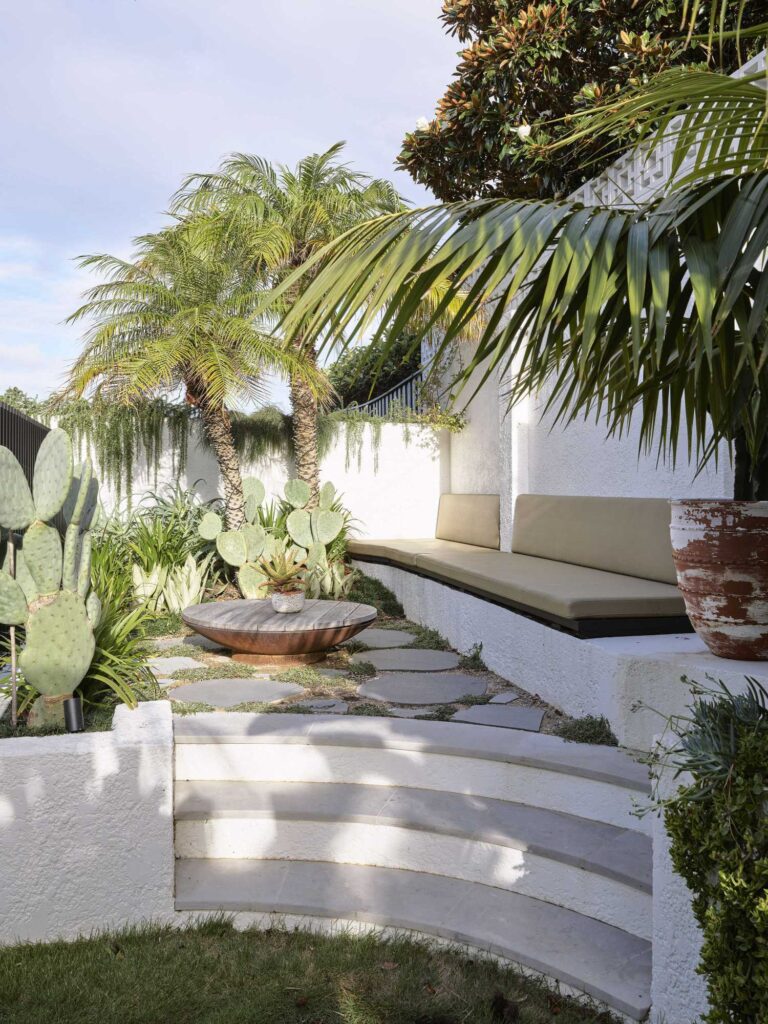
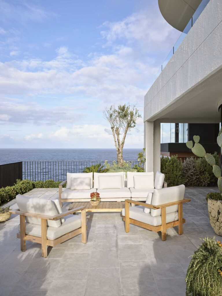
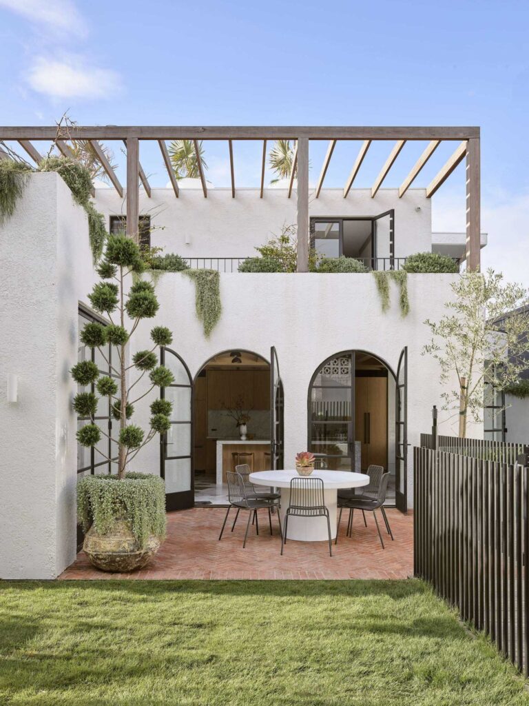
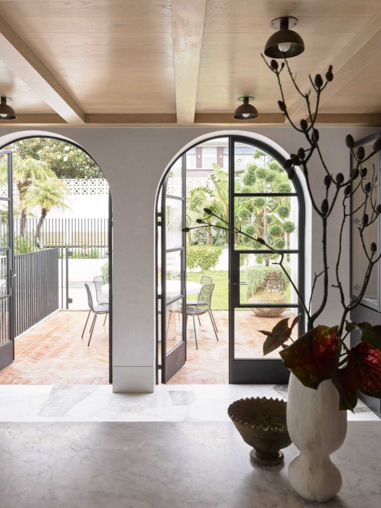
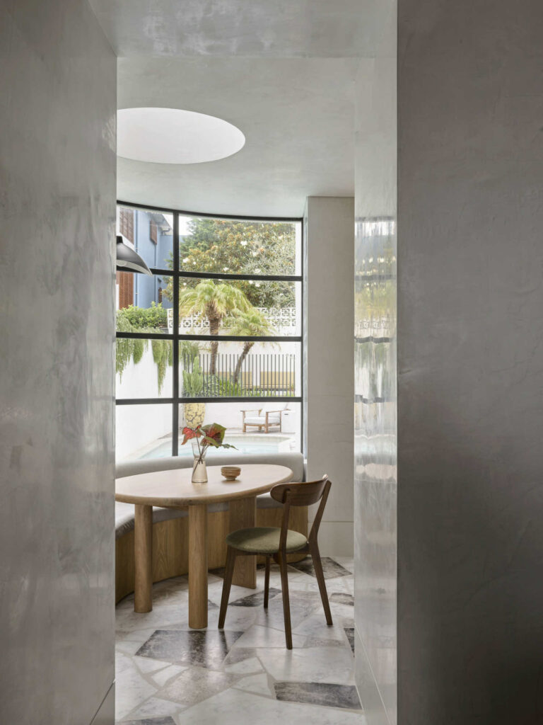
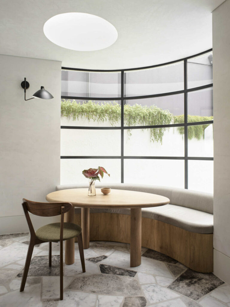
Modifications were made to the exterior building envelope, including doors and windows, cladding, entries, external decks, facades, and pergolas. The swimming pool was located in an old driveway excavation, inspired by P&O, and the breakfast nook overlooks the pool length and creates a folly within the neoclassic formality of the plan at large.
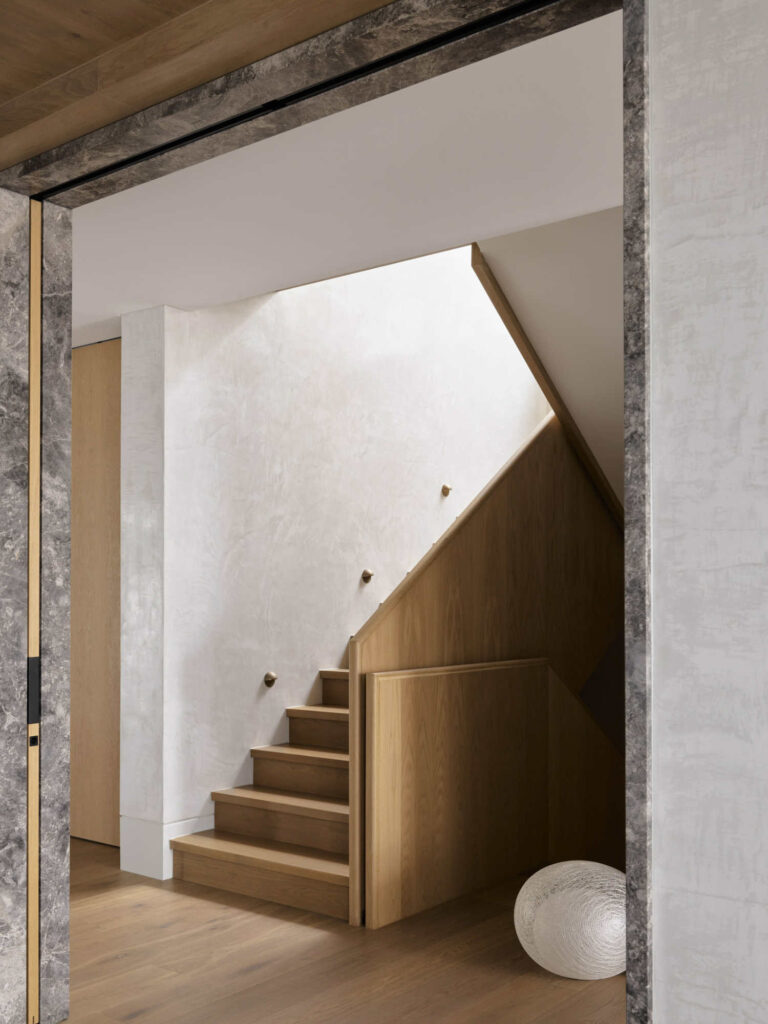
“The home contains five bedrooms, family bathroom, ensuite and robe and roof access to the upper floor. A lower guest bedroom, rumpus, living and dining room, breakfast nook and kitchen open to the rear garden and pool. The lowest level contains gym, sauna, wellness and garage.” – say designers.
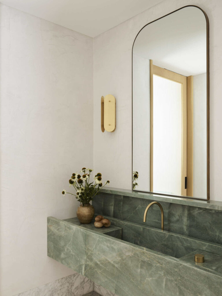
The facades of the house are “Mediterranean inspired monolith” with flowing green planting as a contrast. The concrete chassis of the old building is made more material and curves are added to the view corner doors. It is a softer, more approachable version of what it was.
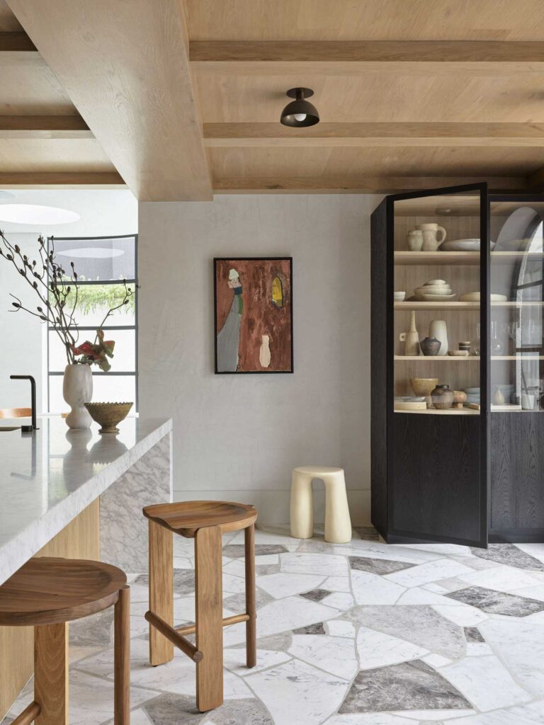
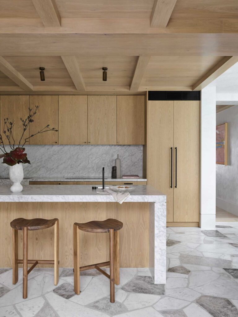
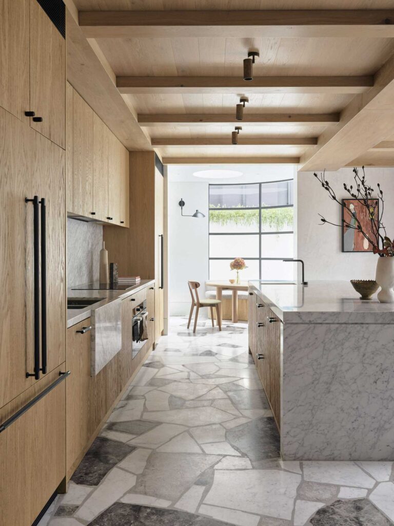
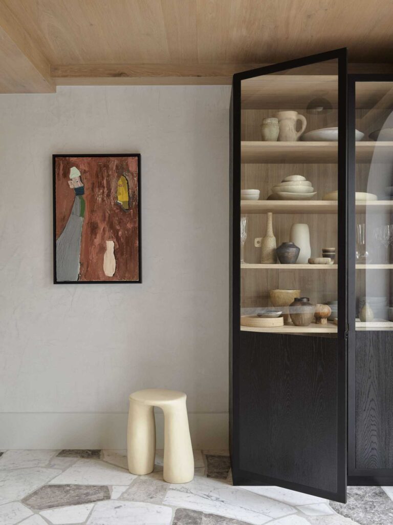
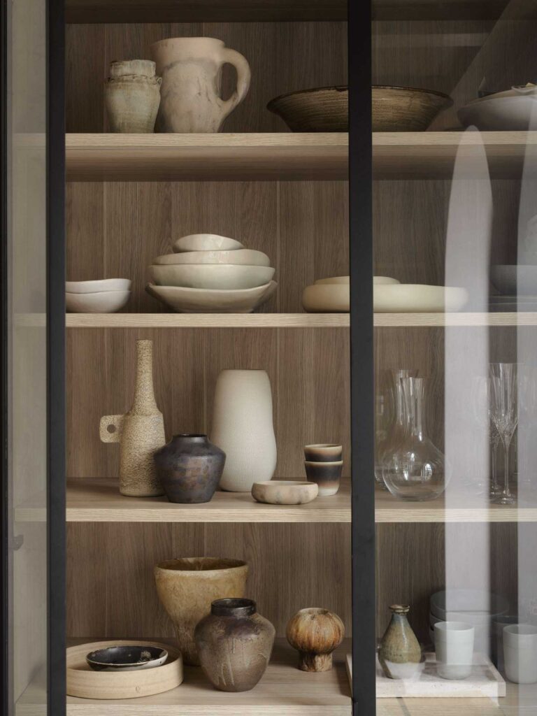
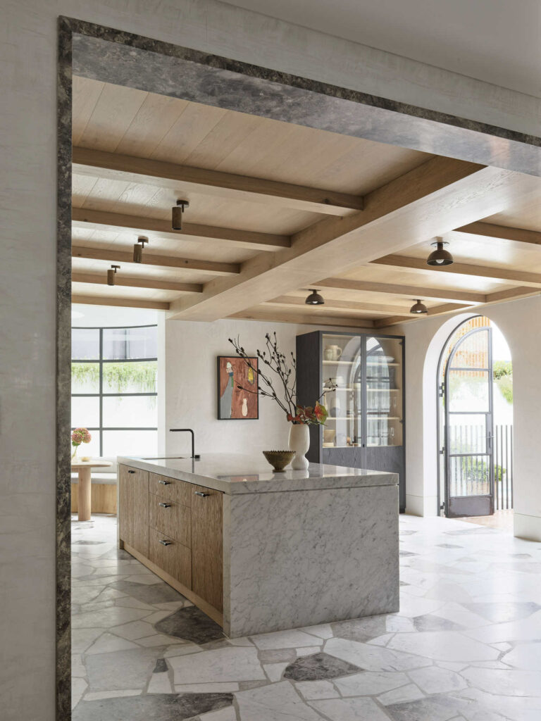
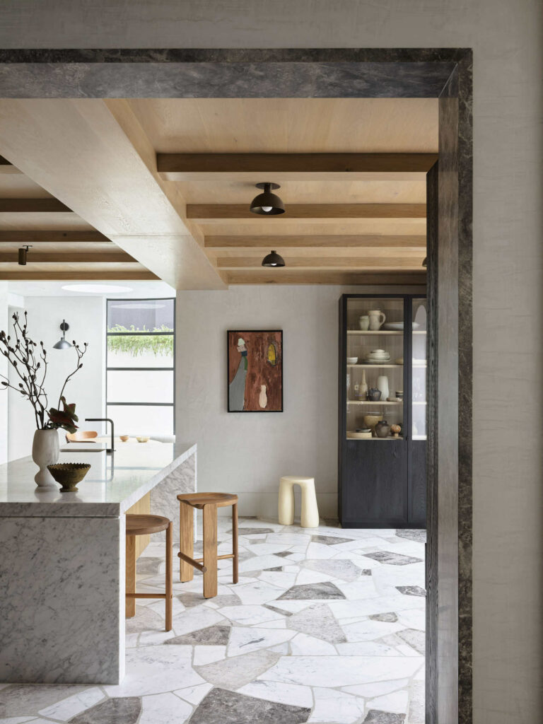
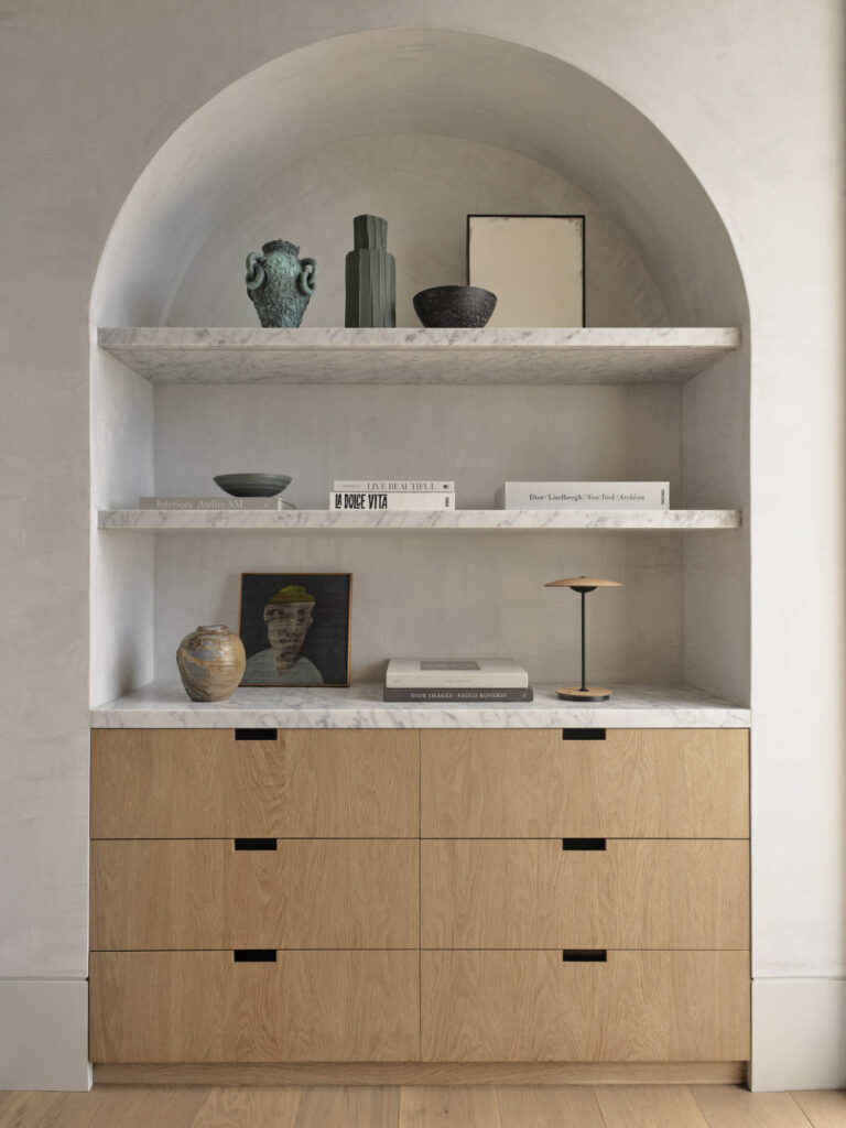
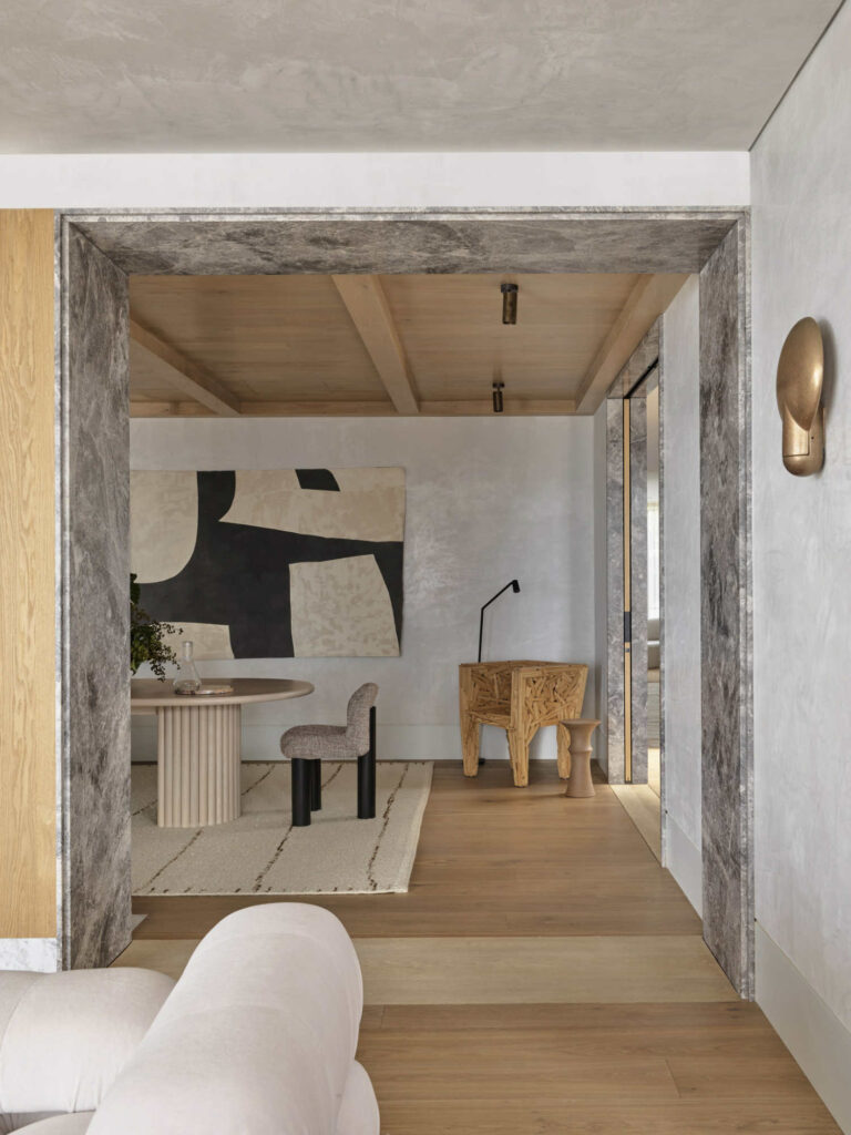
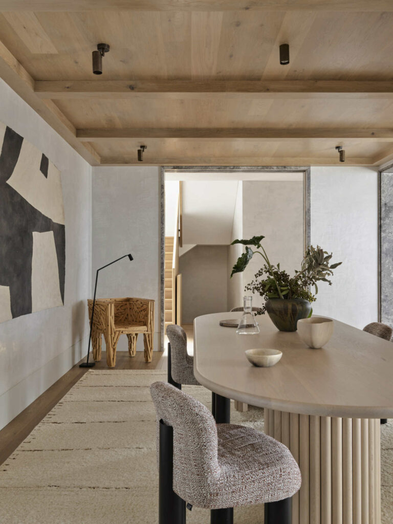
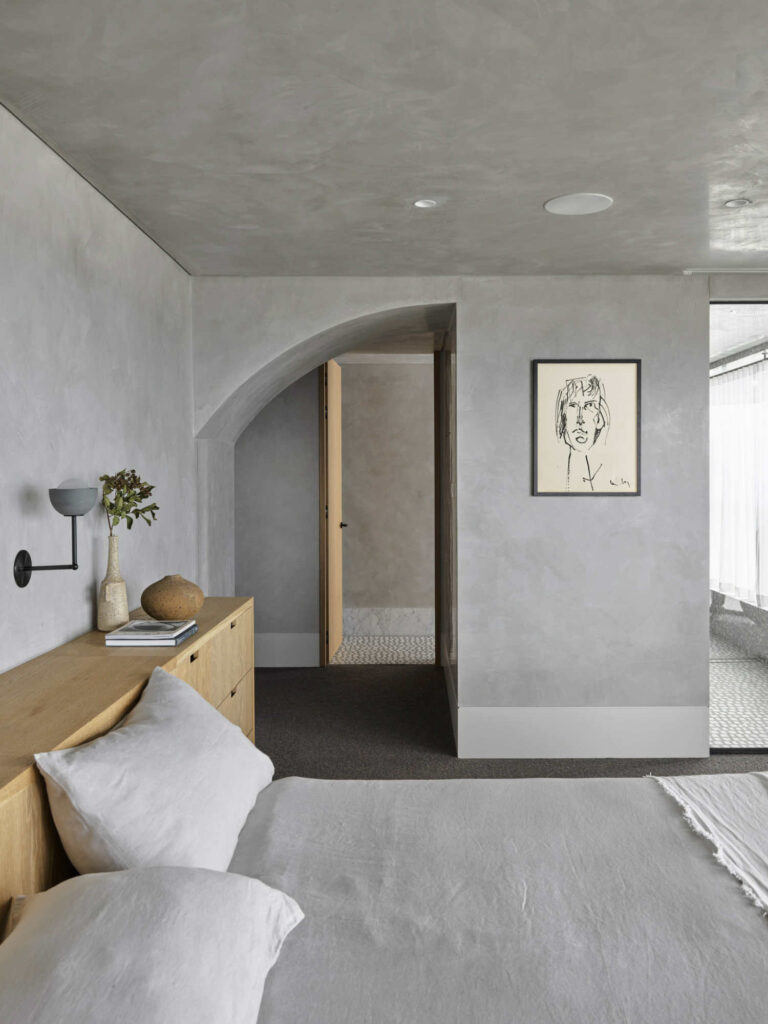
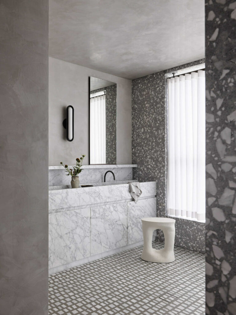
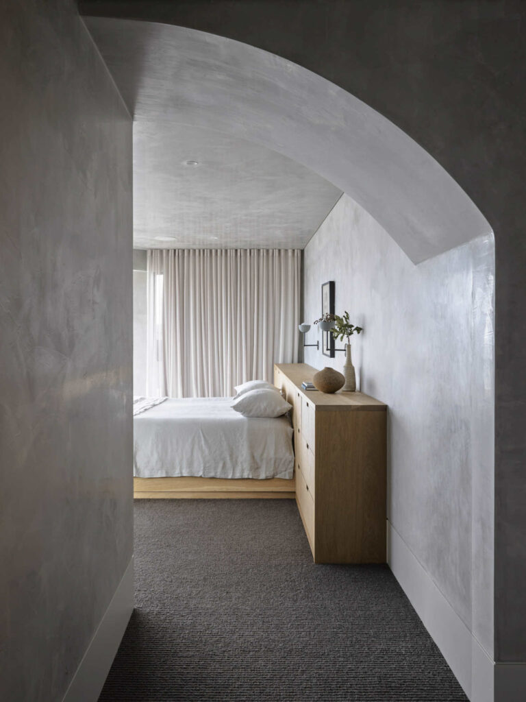
Due to ceiling height constrains, designers had to ensure that the finishes and ceiling details are focal. Also, “existing masonry walls required designers to play within structural constraints, with room dimensions taking on careful geometries.”- remembers designer.
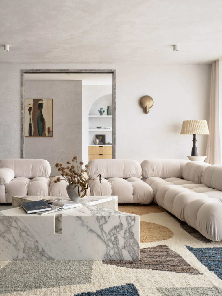
The exterior facades of the building contain terraces, gardens, balconies and planted edges. The building is conceived to become lost in gardens, the pool conceived as a moment of P&O interaction with a curving dining niche. The palette is richly textured but leans monochromatic.
Despite the project’s challenges, principal Jeremy Bull says, “I liken these projects to breathing new life into an old maid. She was substantial in her structure but devoid of spirit and certainly absent of any operational utility. I think that the act of storytelling well into a not-too-old-but-plenty-bad chassis in a way that feels personal and convincing is a worthy exercise and one I am quite fond of. The building is once again breathing and quite alive. She feels both then and now. Aged and contemporary. Ready for a new family and her next 30 or so years I hope.”
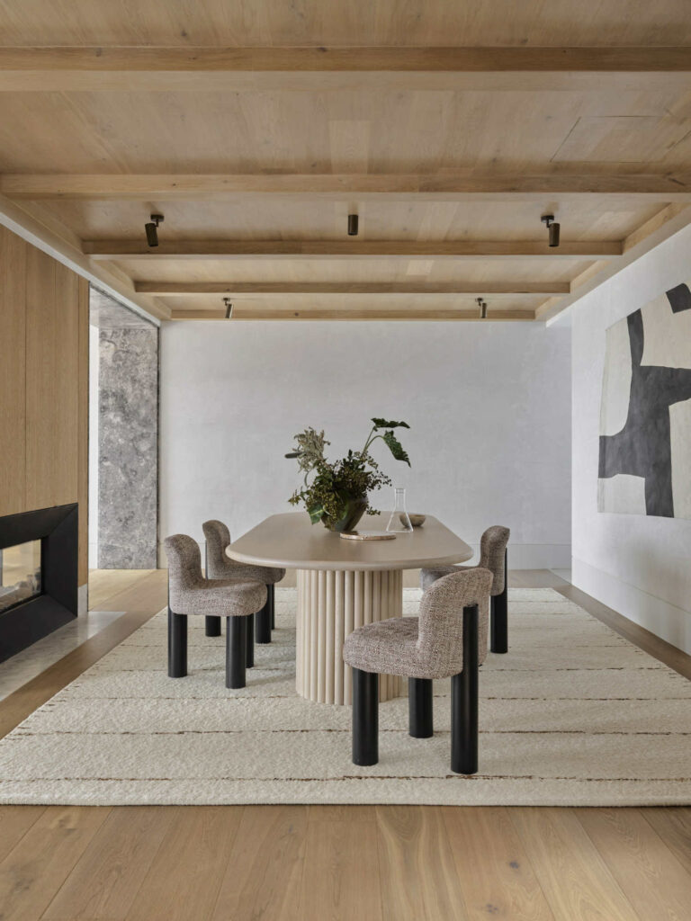
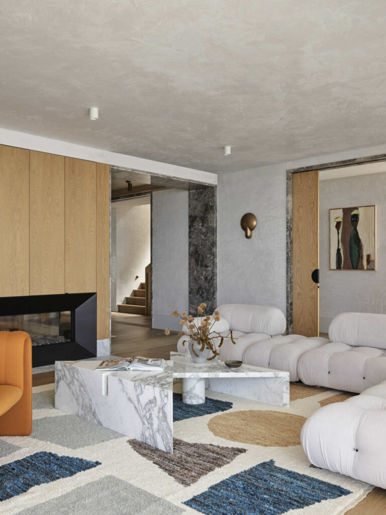
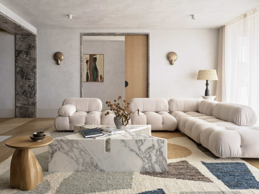




Principal Architect: Jeremy Bull
Interior Design Team: Shelby Griffiths, Jordan Fleming
Follow AUTHENTIC INTERIOR on Instagram for more inspiration, backstage and news.
Are you a design decor brand, interior designer, a hospitality space, artist looking for unique content created for your brand? We are professionals in this field and can help you grow – please use contact form and we’ll send you media kit.


